Media Markt Spain
Year
2015
Deliverables
- UX Consultancy
- Mobile App UX-UI Design
Accepting payments made easier and faster through mobile phones.
Media Markt wanted to change how users purchase their products seamlessly and transparently. Why wait for queues? Why go through a till? Why use a cash machine when the assistants can be wherever the selling decision is?
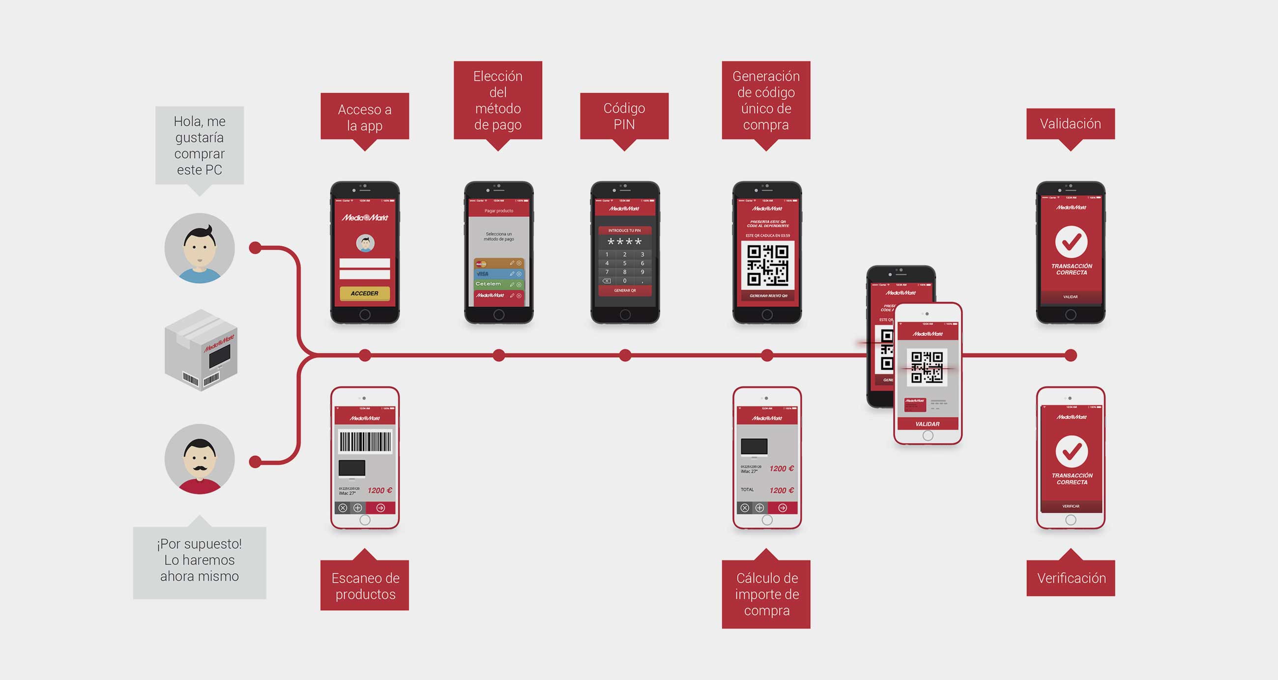
Come -> Choose your product -> Pay -> Pick it up -> Leave.
No wallets. No physical credit cards. Just phones.
Welcome to the future.
Challenge
Let’s create a new model for paying and cashing just with your phone at a large store
Approach
The MYMOID mobile payment system had been initially developed to enable customers to make payments directly from their mobile devices using a QR code printed on their receipt. However, Media Markt identified several critical issues with this approach. Firstly, the reliance on customer phones raised concerns about potential signal issues and device incompatibility at the point of sale. Secondly, Media Markt’s existing payment flow required transactions to be processed at two levels: within their CRM, which managed cash control, and the payment method itself. This necessitated a redefinition of the payment flow to meet Media Markt’s requirements while maintaining the core user experience principles of MYMOID.
The new flow needed to address several key challenges:
– Media Markt required a more controlled payment process due to possible connectivity issues and the complexity of integrating with their CRM.
– The proposed changes had to account for Media Markt’s organizational culture and the substantial effort needed for device upgrades and staff training.
– The initial user-centered approach of MYMOID, which empowered users to handle all payment steps (method selection, order capture, and approval), needed to be adapted to a more rigid, less flexible solution.
Additionally, the app had to function independently while integrating seamlessly with various devices, CRM applications, and databases. This flexibility would allow store assistants to perform their tasks across different locations, but it also introduced security concerns, such as the risk of device theft and connectivity problems.
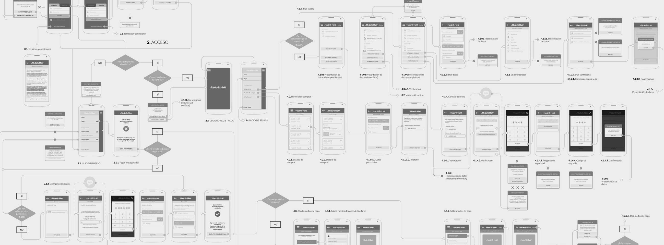
Preliminary research revealed that the project scope extended beyond redefining the customer payment experience. It also needed to enhance the assistants’ workflow, ensuring both sides of the transaction were integrated within a broader system of payment methods and CRM. This led to an expanded set of user stories, reflecting the complex interplay between customer interactions, assistant roles, and backend systems.
Process
In rethinking the payment process for Media Markt, we recognized the need for increased interaction between customers and till assistants. Unlike the original MYMOID payment process where the customer could complete the payment independently at their own pace, the new flow required real-time coordination between the customer and the till assistant. This change aimed to address potential delays and ensure a seamless transaction experience. The till assistant’s role expanded to not only initiating and completing the payment but also registering the receipt along with the cash.
The complexity of the process highlighted the importance of the device’s role in facilitating coordination between the customer and the till assistant. We needed to ensure that both parties could monitor each other’s actions to maintain a smooth flow. Initially, we defined the overall payment workflow, considering how it would integrate with the CRM server. However, as we progressed with the UX design, we had to separate the flows to address specific needs and scenarios.
Key steps in the process included backend configurations, CRM integrations, operations latency, security issues, and peripheral devices connectivity. We divided use cases into three main groups, each affecting the UX differently:
- Purchase Preparations: The customer selects the payment method, and the merchant registers the checkout.
- Purchase Action: Interaction between the user and the merchant for validation.
- Purchase Registering: The merchant adds a receipt, and the user receives purchase confirmation.
While device setup and maintenance were crucial, these were considered more business concerns than UX issues. We addressed multi-user features and activity registration but relied on the backend and selling side for implementation.
Solutions and iterations
Drawing from our MYMOID experience, we aimed to simplify the payment flow, making it predictable and understandable. Although this approach was more complex due to the need to manage receipts, link bills, and handle the customer’s device, we focused on clear steps and dialogue between the machine and the user. This helped the assistant understand their actions at each moment, considering the detailed attention required during payment despite training.
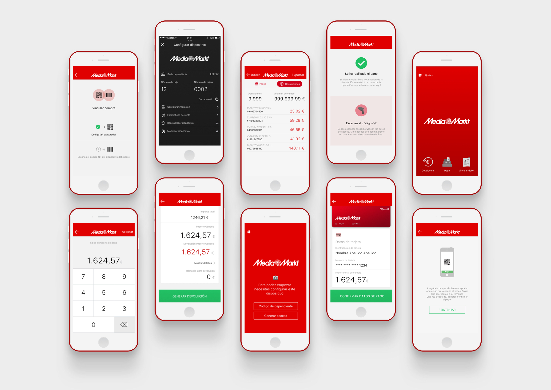
The UI was designed to be clear and easy to understand. Although the process was long and prone to mistakes, starting over from the beginning was necessary for any error. Therefore, we emphasized clear messages, iconography, and steps. The customer’s app was designed to be attractive, while the merchant’s app was neat and functional with plain colors, large buttons, and direct instructions.
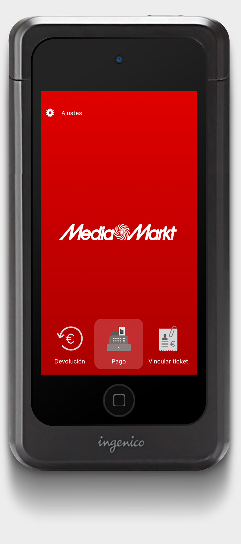
We also considered the physical usability of the device. Despite being a light and thin iPod 5G, the POS case made it heavy and difficult to hold. We visualized the scenario to ensure ease of use, with easy-to-tap buttons and evident behaviors. We aimed to keep the flow as short as possible, reducing delays with brief animations and direct control.
Final design
The final design of the MYMOID payment system for Media Markt balanced simplicity and functionality. The UI was simple, balanced, and elegant, adhering to POS terminal aesthetics and brand guidelines. We achieved a seamless interaction between customers and till assistants, ensuring the payment process was agile, quick, and reliable. The design framework facilitated a coordinated effort, enhancing the overall transaction experience and meeting Media Markt’s requirements effectively.
Section No. 1
Results
In the end the result was a sleek, efficient and simple app, just the way we wanted it to be –except for some inevitable development limitations.
The main success was to translate our UX to the merchant’s app, integrate the customer’s app to our flow and convert it all in a complete payment process. Although the actual revenues are still to be known (it’s still a pilot program) the main success was to create a new cashing model, mobile centred and functional that helped to make a step forward at customer experience.


