Year
2014
Deliverables
- Brand
- Product Design
- Mobile App UX-UI Design
Helping tourists from abroad to discover experiences easily and from everywhere
Turism in Huelva is a still undiscovered treasure. Due to the proximity to some other tourist areas as Seville and Algarve, Huelva offer is hidden from the main tourism operators but it provides an uncluttered variety of nature, leisure and adventure. Natureway wanted to help tourists to discover those activities and offerings.
Challenges
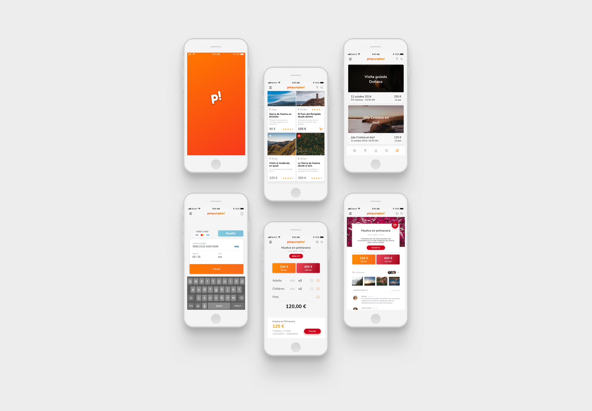
Let’s design an app to let tourist enjoy adventure, leisure and fun in Huelva from wherever they plan their activities
Section No. 1
Approach
It was unnamed. That was the first step to be made –finding a name which really explained the service. It needed to be short, sticky and self explained.
After some research and proposals seeking its own identity, finally appeared a name which would agree all stakeholders and owners: pim-pum-plan!
An onomatopoeic international name open to suggestions that would work at the context. No more, nothing less.
The design of the name and its identity was simple, relying on the logotype, playful and thrilling.
After that, we started working on the UI look and feel.
Section No. 1
Problems
The main problem came from the decision taking process. From the beginning decisions were made by the stakeholders group, which really didn’t have much experience at app or websites development. On the contrary, their insight was basically from marketing and business management, so the user centred design process remained in danger on almost every step we made. Besides, the most valuable voice among them was the project CTO that was urged to get results in a short term, so during the design process we needed to negotiate a rapid minimum viable product that wouldn’t be completely polished. To make things easier my work would consist basically in creating a UI framework, the design of some key screens and a primitive UX guideline to be applied during the app and website develop.
Because of the stretch budget and schedule, after that I’d lose any supervision over the project, so my work should be as detailed as possible in order to release a reliable product all in all.

#333437
#007eff
#c62a41
#333437
#333437
#333437
Section No. 1
Performance
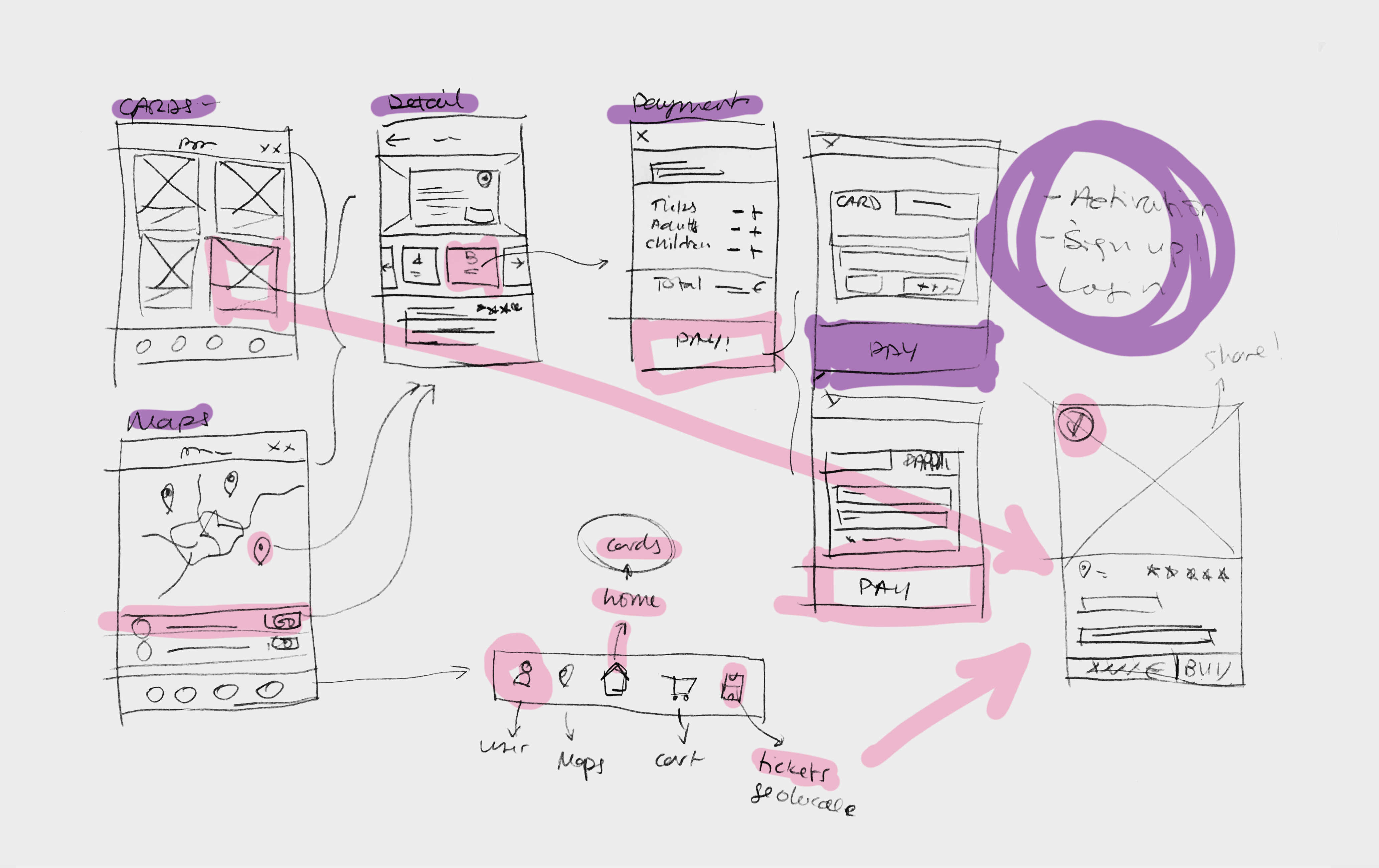
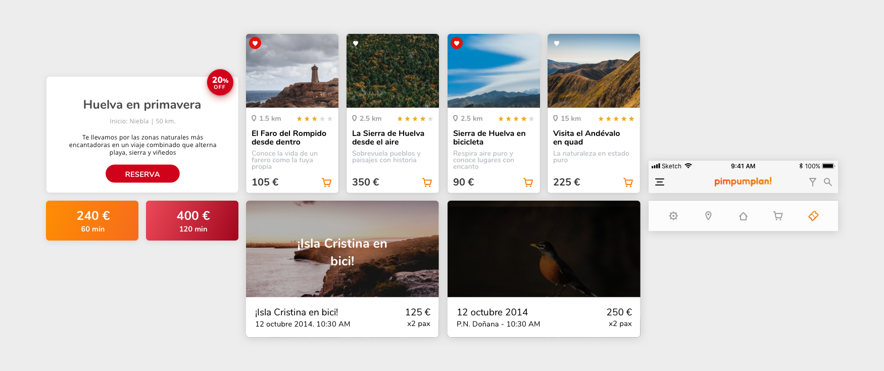
According to the product owner decision, the app and website anatomy would reply the Pinterest content structure –a card view that was starting to succeed as a visual content sorting and exploring. The idea was to summarise the activities in one single picture and a prize. Aside to that, some other information was to be added: distance from location, rating, price and social links to share the activities on the networks.
Although the inspiration came from Pinterest, the booking process was made from scratch –and turned to be quite similar to the later Airbnb UX, which means we were on the right way despite the lack of budget and time to make decisions!
The app was intended to be hybrid for both main OS –iOS and Android. The main purpose was to create a self-dependant framework that could be used seamlessly on any of them. The display
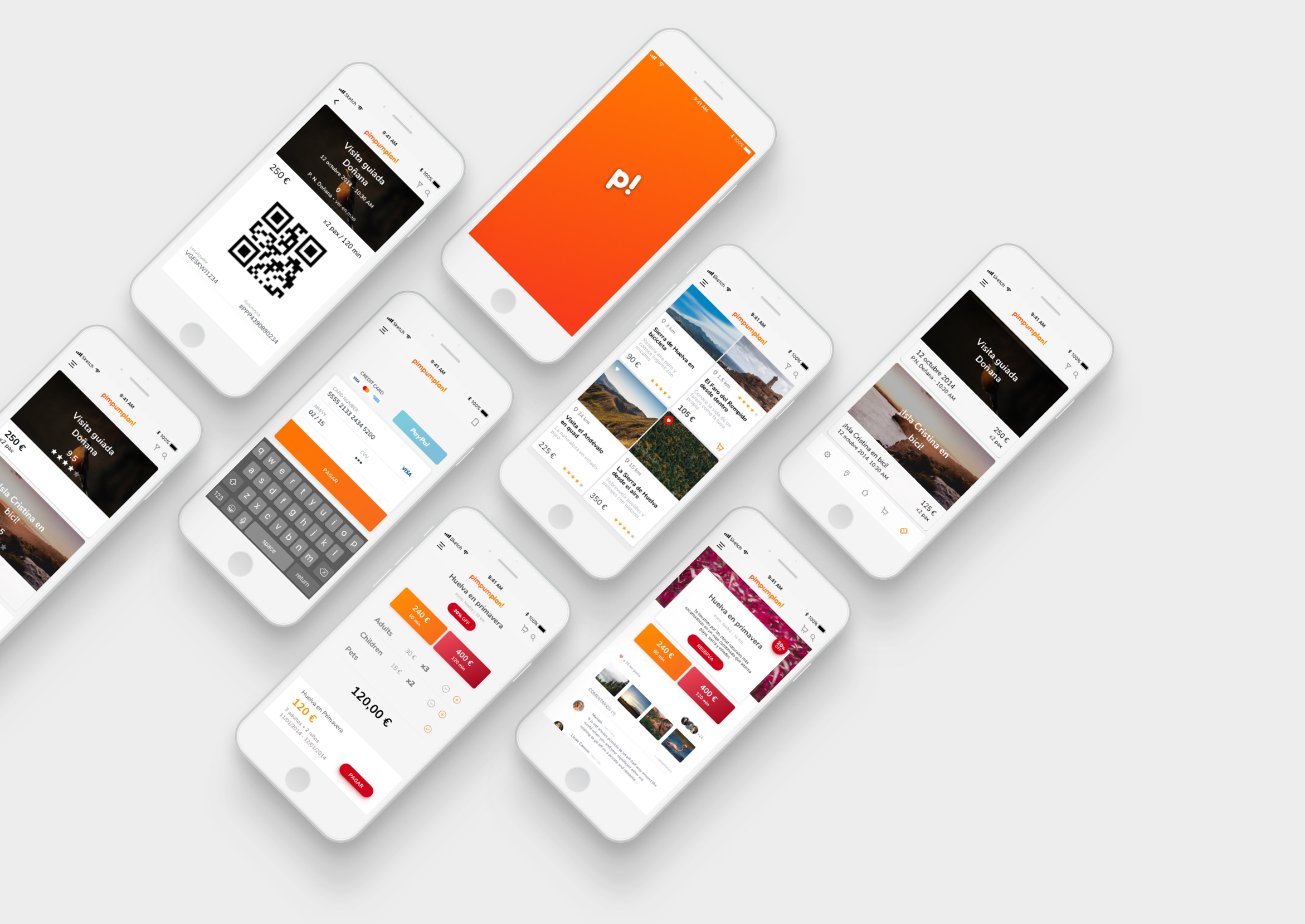
To make things easy I chose as key references the home screen (card view and map), enrolment process, profile information, activity detail, purchasing process and error and success screens.
For the website, the result was quite alike –home, activity detail, error screens and some of the user login status. Anyway, the trickiest requirement was building the UI on a responsive grid. The website was intended to be displayed on digital banners at some information places located at airports, hotels, railway stations and tourist centres. The responsive design relayed on the 960 grid system (previously to Bootstrap or Foundation design frameworks, that by then were recently released and still unknown for the developers team), taking some of the devices breakpoints as a reference.
As for the app we paid special attention on the user journey, for the website we did on the overall design to be deployed easily. Both kept the same design guidelines: colour scheme, font families, interaction elements and components.
Section No. 1
Solutions
To achieve our schedule in shorter terms we decided to release a complete framework. By then, current UI-UX design tools such as Sketch, Axure or Invision weren’t stable or intended to be for those purposes. Besides, as it needed to be edited and used after the design process, the release had to be done on Adobe Photoshop+Adobe Illustrator, which made it more difficult to add notes and comments.
On the other side, the workflow was remote, so we needed to set meetings every now and then to check that the results still met the specifications set.
Luckily, the product had a clear basis to start from and the needs and musts were easy to identify. We made a great effort to teamwork together and the project was finished in time.
Section No. 1
Results
Pim Pum Plan! was discontinued as a business in 2015 after operating for 2 years. The stakeholders had made an effort to keep alive their innovative entrepreneurship in Huelva but considered the market wasn’t ripe enough after all and chose a different strategy. Aside from that, after releasing the visual design and UI frameworks, the company made deep changes over the original design to achieve a basic product.
Anyway, for me it was an interesting experience, from which I learned my UX design foundations and must-do and must-not-do for future projects.


